Rare Maps
Rare Atlases
Rare Books
Rare Prints
When it comes to collecting maps, no topic is more divisive or confusing as colour: is it original? And what does original colour mean? How can you tell?

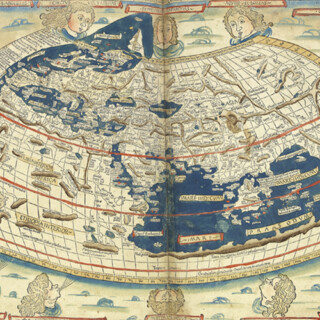
The earliest map printed in colours was made by the Florentine printer Antonio di Bartolommeo Miscomini in his 1493 edition of Lilio. A small “T-O” map, the woodcut image was printed in red, with the lettering printed from type in black. The first atlas printed in colours was the 1511 Ptolemy, printed in Venice. Colour printing did not really take off in earnest, however, until the middle of the nineteenth century, with the advent of lithography and other advances in printing. Most maps and prints printed prior to 1870 were printed without colour, using black ink either from a woodblock or engraved metal plate. However, many publishers added colour (typically watercolour, but occasionally gouache) shortly after printing and before the maps or prints were bound or mounted on linen for sale. Often publishers would offer atlases made-to-order, with the option to upgrade with hand-colouring.
Colour was not only used for decoration – it was also a tool to communicate information. A very early example is the 1511 Venice edition of Ptolemy’s Geographia and its two-colour printing: Major regional names are printed in red and other, lesser names, are printed in black using inset type. It has been suggested that the dual-colour printing style was done to mimic contemporary portolan charts, which used black and red to distinguish toponyms of various importance. The text in the book says that it used the maps of navigators to update Ptolemy’s original work, and this influence may also have extended to the aesthetic.
When it comes to classifying types of colour, we use the following language: Original colour Colour added by the publisher from a known palette at the time of publication.
Contemporary colour
Colour added at, or around, the time of publication from a colourist other than publisher, typically using a palette different from that usually associated with the publication.
“Later”, “period”, “old”, or “recent” colour
Colour added at some time between, say, ten years of publication and today. These phrases, if used, should specify an approximate date or period, and typically do not denote an item of greater value than one with modern colour.
Modern colour
Colour added recently, probably within the last 30 years. We try to only offer books, maps and prints in original, or contemporary colour, or uncoloured. This is because we believe in selling material in as close to its original condition as possible. We say “try” because, just like you, we are collectors at heart and, just occasionally, we abandon our principles for that “must have” item! In these rare instances, please rest assured that the item will be clearly described as such.
Distinguishing between original colour and modern colour can be difficult. There are many modern colourists who are adept at mimicking original colour in order to deceive. For a collector trying to discern whether a map has original or contemporary colour, It is helpful to learn about the history of cartography and the conventions around colouring maps for a specific country, time period or publisher. Some cartographers, such as Coronelli, for example, produced maps that were never intended to be coloured, whereas there are other cartographers whose maps were almost always associated with contemporary colouring. The colour itself comes in different forms. “Outline colour” refers to decoration only on the borders of a map, whether it between countries or county lines. “Full colour” refers to pigment that covers the entirety of the map, and particularly elaborate examples include gold or silver highlights. The coloured pigments that were traditionally used to decorate maps often included copper or sulphuric acid, both of which oxidize over time and lead to colour changes and pigments seeping through to the verso of the map. The predominate green pigment, verdegris, featured high levels of these materials and therefore it is often possible to see evidence of the areas decorated in greens on the verso.

 The verso of the second example does not have any colours visible, even though large swathes of green have been used to decorate the map.